Monday, July 22, 2013

Facebook Acquires Assets Of UK Mobile Bug-Checking Software Developer Monoidics

The link to the full story is here


Facebook has just agreed to acquire certain assets and hire some employees of UK software verification developer Monoidics. Pending closing conditions, Monoidics’ engineers and tech staff will join Facebook’s London office. Facebook will apply the Monoidics automatic formal verification and analysis software to its mobile development process to scan for bugs.
The Monoidics team writes: “In 2009 we started this company with the goal of making the best automatic formal verification and analysis software in the industry. We’ve gone from theoretical ideas in logics of programs all the way to a company with a world-class engineering team, real customers and an office right in the midst of London’s Silicon Roundabout. It’s been incredible journey. . . we’ve loved every minute of it.” But now its techies are going to continue their mission at Facebook, though the rest of team isn’t coming along. Terms of the deal were not disclosed.
Facebooker Phillip Su explains, “We have always focused on hiring smart, talented engineers — and in this acquisition, we found many. Their entrepreneurial spirit and desire to make an impact make them great additions to Facebook. We can’t wait to have them here!” As for exactly why Monoidics will be doing with Facebook, the company tells me, “They produce some of the best automatic formal verification and analysis software—code that checks other code for bugs—in the industry, which we will apply to our mobile app development to keep a high quality bar.”
Monoidics’ Infer Static Analyzer helps developers deliver bug-free code with a focus on memory safety and security. It turns bug detection into a mathematical algorithm, generating a correctness proof that guarantees software has no memory leaks or illegal pointer references. It works on all sizes of apps, and can recognize what parts of a piece of software have been updated so it doesn’t redundantly re-scan approved code. Meanwhile, Monoidics’ X-Ray system can visualize software to highlight areas of risk so bug-crushing teams know what to investigate. Monoidics clients included ARM semiconductor, Airbus and Mitsubishi Electric.
Facebook recently moved to a scheduled release cycle where it pushes out iOS and Android updates every month or two months. It also recently launched an Android beta program to let users help it test potential features. All this fast shipping means Facebook could risk pushing out buggy apps. Monoidics could make sure that doesn’t happen.

Wednesday, July 17, 2013

New Strategies Make LinkedIn Stock An Attractive Investment

The link to the full story is here


LinkedIn (LNKD) is now 10 years old and it seems to me that it is executing its business strategy as well as it could have in the past, specifically in terms of product innovation and development and the creation of an internal culture that will take this company forward in the future. At around this time, many technology companies find it difficult to maintain the momentum because the founders tend to leave, especially after an IPO, and their entrepreneurial instincts and passion are sorely missed.
The business of business networking
The concept of business and professional networking has made considerable progress because of the success of companies like LinkedIn. Though not as immediately popular or successful like the social networking sites such as Facebook (FB), business communication is being transformed through the use of networking and information sharing. The business of online professional networking is scaling up in areas such as recruitment and product marketing and promotion while social networking sites are expanding the range of services that they offer to businesses and professionals. Since the IPO in 2011, LinkedIn has generated more than half its revenue from talent solutions, which link potential employees to recruiters but is having problems in generating ad revenues from its growing base of mobile users. Premium subscribers generate ad revenues of only 20% of total revenues because of the low rate of conversion of users to paid subscriptions. One impediment to progress has been the lack of video interaction, which means that many recruiters are unable to use LinkedIn to conduct preliminary interviews for potential candidates.
The business strategy
For the first eight years, LinkedIn concentrated on connecting people with one another but, with its Influencers program, it has moved to creating an audience for prominent professionals to communicate their ideas and it does not cost them one penny in compensation. Among these influencers are people like Bill Gates, Barack Obama, Sir Richard Branson and Shinzo Abe. The response has been encouraging and is another step forward in increasing engagement with users. This should ultimately result in users returning to the site time and again and also spending more time there. Unlike Twitter or Facebook where messages keep users coming back, so far, LinkedIn has made it necessary for users to only come back now and again to check on jobs or to update resumes.
The new engagement strategy seems to be working because in the first quarter, page views increased by more than 60% from the same quarter of the previous year and top posts are regularly producing more than 100,000 views. Because engagement makes the site more useful day to day, an increase is bound to result in increased ad revenues and the sales of its own services. Revenue for the first quarter grew by 72% year-over-year to $324.7 million though it is hard to pin down the specific reasons.
The new focus on media
As another prong in its engagement strategy, the company has decidedthat the more news it provides the more reason for users to keep coming back. Between the acquisition of the new reader Pulse and the growth of LinkedIn Today, which is the news on its home page, it is emerging as a serious alternative for business news. The company has said that it would like the user to start every day to check out the latest insights and the news. Hopefully, this will increase sales of subscription based services and generate further online advertising revenue.

Catching Up With Android, Google Maps 2.0 For iOS Offers iPad Support, Indoor Directions

The link to the full story is here


JORDAN CROOK

posted 3 hours ago
9 Comments
Screen Shot 2013-07-17 at 9.53.55 AM
Poor Apple Maps. While we see very minor improvement from Apple’s year-old Maps application, Google continues to improve its world-class offering pretty rapidly.
Why, today, in fact, Google launched an update to the Google Maps for iOS app, adding support for the iPad, indoor maps, and a slew of other features that were released with the recent Android Google Maps update.
Google Maps 2.0 now fully supports the larger screen sizes of the iPad and iPad mini, as well as offering indoor maps with walking directions for transit stations, airports, malls and other large buildings.
Past that, you’ll also notice that the Google Maps iOS app now offers better navigation with live traffic updates and incident reports. Meanwhile, Apple Maps still hasn’t figured out transit directions.
Google 2.0 also includes 5-star ratings for various locations, alongside reviews from friends and Zagat content, and if you were perhaps looking for a little marketing in your Maps app, Google is also pushing Google Offers to users through the navigation app.
Google has always been ahead of the pack when it comes to Maps, and with the recent acquisition of Waze crowd-sourced mapping technology, Google’s lead will likely only get bigger.
The update is available now in the Apple App Store.

Google Opens The New Google Maps For Web To Everyone

The link to the full story is here


Remember that shiny new Maps web interface that Google started showing off at I/O back in May? It’s here!
Technically, the new Maps interface has actually been here for a while… assuming you signed up for an invite shortly after it was announced and were able to make it through Google’s invite queue before they opened the floodgates today. (I signed up a few hours after the announcement and just got my invite a week or two ago.)
Need a refresher on what’s new? Here’s the bulk of it:
  • A new, fullscreen interface
  • Maps now uses vector data rather than graphical tiles for faster loading and handling
  • You can now zoom way, way out. As in, out into space. They’ve built in a Google Earth-esque planetary view, assuming you’re on a beefy enough computer running a compatible browser (Chrome or Firefox)
  • Photo Tours that let you explore famous locations through a series of stitched-together, user-submitted photos. It’s more trippy than it is useful, but it’s still worth checking out. (To see one, go to a major city [like San Francisco] and click the little expansion arrows in the very bottom right)
  • Most routes will automatically show public transport alternatives alongside your driving options
  • Quick comparison charts for public-transport options, graphing the difference in stops/overall time
But wait! Don’t head straight over to maps.google.come and expect the new look just yet. While they’ve ditched the invite queue and the whole having-to-wait bit, you’ll still need to opt in. To do so, just go to this page, scroll down to the bottom, and hit the “Try Now” button. It should let you in immediately.

Monday, July 15, 2013

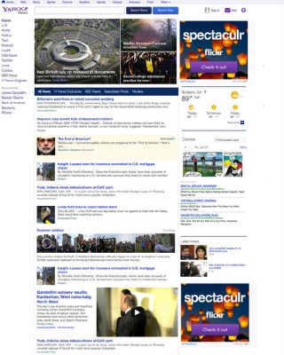
Yahoo News Gets A Makeover, But The Bigger Improvements Are Under The Hood

The link to the full story is here


A little over a month after Yahoo partnered with Twitter to beef up its homepage news feed with relevant tweets from news organizations, the company is today announcing a major makeover for one of its flagship properties, Yahoo News. The updated Yahoo News site is has been redesigned with a more modern look and feel, to better fit in with Yahoo homepage’s new look, introduced earlier this year. But the bigger improvements are the less visible ones.
At the time of the homepage revamp, Yahoo said that the most notable change was not the homepage’s appearance, but rather its increased emphasis on personalization. The same, apparently, holds true for the new Yahoo News site. Although at first glance, users will just notice its cleaner, less dated look, the focus here again is on personalization.
The news stream is now customizable, so users can tell the site what kind of news they’re interested in seeing. You’ll notice that every story now has an “X” next it when you hover over it, and when clicked you can indicate why you don’t want to hear more about that story in more detail by clicking the topics associated with that particular news item.
yahoonews
For example, after clicking the “X” over a story about the Hernandez homicide investigation, the message reads “show me fewer stories about” and then provides a list of choices including “sports & recreation,” “football,” “Aaron Hernandez,” “National Football League,” or “New England.” Even if you don’t drill down into one of those choices, after clicking the “X” the story will become hidden from the news feed in a few moments.
Though seemingly a minor thing, the fact that Yahoo News is pulling out the major subjects involved in a news story like this indicates there’s some more serious technology under the hood, like semantics. We saw Yahoo use similar customization and personalization techniques when it debuted a new Yahoo iOS app in April, which took advantage of Yahoo’s $30 million acquisition of news summarization startup Summly. The app also allows users to select topics that interest them, as well as flag those that do not – choices that are synced across platforms when users are logged in with their Yahoo IDs.
As with the homepage update, where the site adapts to learn users’ preferences as they click, the new Yahoo News will also learn of your interests based on the stories you click through to read, even if you never explicitly tell it to stop showing you items by clicking the “X.”
The updated News site is also described as faster and better organized, so you can more easily click to the categories of interest like “science,” “politics,” “health,” etc. It now features Yahoo partner content like ABC News more prominently, as well.
The redesign is also arriving on iOS devices, and soon on Android, too. The roll out is starting now for U.S. users, and will complete in a couple of days.

Thursday, July 11, 2013

To Drive More Clicks, Twitter Is Testing A Popular Tweets History Feature

The link to the full story is here


Twitter has started to test a new feature related to its embedded tweet service: a list of links, below the tweet, where a tweet has been referenced. It’s the latest move in Twitter’s longer-term strategy to make the platform more interactive, which started a little over a year ago and has brought us Twitter cards with previews, as well as the shortcodes for users to create pictures of the tweets — aka embedded tweets — elsewhere.
For now, this looks like only a limited test.  Mikko Hypponen, the outspoken chief research officer at F-Secure who first brought this to our attention, has also noted that the feature has come and gone, and returned during the day.
The links in turn go directly to the pages on the sites, not to tweets, Hypponen told me.
I asked Twitter about what is going on, and a spokesperson pointed me in the direction of this blog post noting tests of “hundreds of variations of new features and designs.”
Regardless of whether or not this feature eventually rolls out to a wider public, listing where a tweet has been used is another sign of how Twitter hopes to continue to make its platform more interactive and less lean-back.
Getting the balance to tip further in the direction of engaged users will mean that Twitter can sell itself better as a broadcasting platform to advertisers hungry to go not just where registered users are congregating, but specifically to where users are logging on, paying attention, and clicking. Conversely, giving users a list of links showing where else a tweet has “travelled” outside of Twitter is a good way of driving more usage of the embedded link feature, and getting more people to effectively become marketers of Twitter itself.
There is also a practical need for something like this to help “close the loop,” as online marketers like to say, between presenting information and actually acting on it. Anecdotally, I’ve noticed that dozens of retweets (much less favorites) of a link do not necessarily translate to traffic to a particular page. It seems that many Twitter users, lured in by the fast pace of Twitter, are happy to use it as its chief source of information as well. Offering one more bit of context — in the form of the history of the embed — could be one way for Twitter and would be users of the embed service to drive more actions from that tweet.
You can also see how a list of links may potentially also come to include a sponsor in the mix, taking advantage of the Google-Adwords-style keyword targeting advertising that Twitter has been rolling out.

With Updates, Twitter Apps Finally Sync The ‘Read’ Status Of Your Direct Messages

The link to the full story is here


Twitter announced updates to its Android, iPhone, iPad, and Mac apps today, as well as its desktop and mobile websites, plus TweetDeck. The main improvement isn’t a huge change, but it does eliminate one of the most annoying aspects of the apps — namely, the fact that they couldn’t tell if you had read a Direct Message on a different device or app.
In other words, if you read a direct message on Twitter for Mac (for example), then opened up Twitter for iPhone, the DM would still show up as unread. I don’t think it ruined the Twitter experience for anyone, but even for someone like me, who doesn’t get too many DMs and gave up on the “inbox zero” instinct years ago, seeing those read-yet-unread messages could be pretty exasperating.
Thanks to today’s updates Twitter says that issue is going away — though you’ll need to make sure you have the latest version of whatever apps you’re using in order for the changes to take effect. I tried it out myself, and seeing Twitter accurately reflect my reading behavior made me pretty happy.
In addition, Twitter says its mobile apps have an improved search experience, with full bios when you search for people, and a “similar accounts” preview. And the iPhone version includes a new “tweet composer” (shown above) that allows you to reply to a tweet without jumping to a new window (so you can see the context for your reply as you type it). It’s also supposed to include a new “people” button in the navigation bar, though I’m not actually seeing that one yet.